
Cloud Dancer: A Caribbean Take on the Color of the Year
- Locale Jamaica
- Feb 13
- 5 min read


A few weeks ago, Pantone named its Color of the Year for 2026: Cloud Dancer, a creamy, airy off-white with subtle warmth. If you’re thinking, “Is it just… white?” you’re not alone. Some people online had the same reaction, calling it bland, vague, or too safe. But what if we looked at this colour not as “empty”, but as a space to fill with meaning?
Here’s where it gets interesting, especially when you come from a place like Jamaica.
In a world saturated with colour planes and trend alerts, Cloud Dancer might look like a blank slate. But in the context of island life, where colour is more than just a fashion choice, this soft, warm white becomes a canvas. It’s an interesting juxtaposition, coming from a people who usually shout their national pride from the rooftops – where can we find this colour in our day-to-day lives?
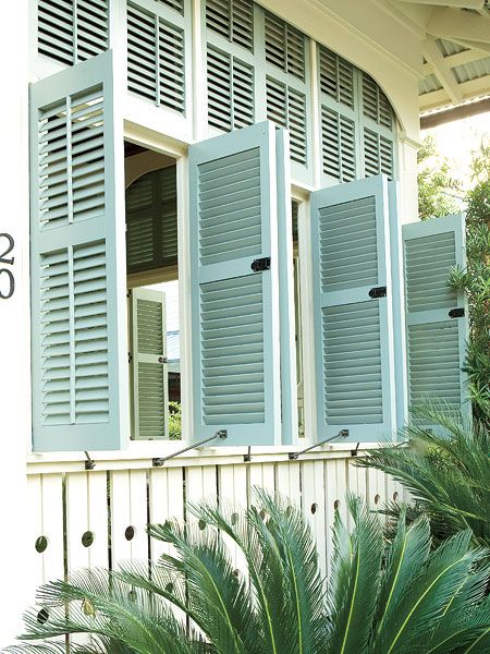
Perhaps in the sun-washed linen on your skin, light filtering through plantation shutters, the shimmer of sand or salt on calm beachy mornings.
Cloud Dancer isn’t here to erase colour, we think it’s actually about making space for it.
And that idea feels very Caribbean to us.
Pantone describes Cloud Dancer as a colour that symbolizes the calming influence in a society rediscovering the value of quiet reflection, a living calm that “invites renewal, vision in serenity, and creative release. Like a blank canvas, it marks the beginning of something new.”

And while that might sound abstract, it actually feels deeply relevant right now. We’re in a moment right now, both physically, and digitally, that’s constantly loud, demanding, and overstimulated. Cloud Dancer offers us a chance to pause, reset, and choose with intention what we build next.
Seen that way, the colour isn’t empty at all. It’s generous. It leaves room for creativity, for story, for culture to show up honestly. And when you live somewhere as expressive and layered as Jamaica, that idea lands differently.
What Neutral means to us
When Pantone first announced Cloud Dancer as the Color of the Year, the reaction was… layered… To say the least. When our day-to-day life is marked by ongoing social unrest, widening inequality, and communities of colour continuing to fight to be seen, heard, and protected, the choice of a soft neutral felt like a retreat.
Cloud Dancer was criticized for being “boring,” “safe,” or “uninspired.” They questioned what it means to champion calm and restraint when so many people are still navigating instability, grief, and resistance. Neutrality can feel like silence, and silence can feel complicit.
But those takes miss something important: balance.
Think about how we live:
Bright kaftans meet sandy beaches.
Handprinted textiles rest against whitewashed walls.
Vibrant street murals sit beside colonial architecture.
Bold prints get grounded by soft, earthy tones.


That said, it doesn’t deny the tension.
Here in the Caribbean, colour has never been accidental. It’s been a form of survival, expression, and joy. Our landscapes, architecture, fashion, music, and visual culture are unapologetically vibrant, shaped by history, resilience, and the refusal to shrink ourselves. We come from places where colour carries memory and meaning, and where brightness is often an act of defiance as much as it is beauty. So yes, we want to see colour in our world. We want our streets, our clothing, our marketing, our spaces to reflect the fullness of who we are.


Simultaneously, balance is something we understand deeply. Island life teaches you that rhythm matters; rest and movement, stillness and celebration, quiet and noise. Cloud Dancer, when viewed through that lens, is offering a grounding. A backdrop against which colour can actually breathe.
That’s where the double edge lives.
Our palette isn’t monochrome – it’s multicultural, and therefore multi-colourful. We know contrast and harmony because we live it every day. Cloud Dancer, we think, is actually meant to amplify colour.

Let’s be clear, we want a world where colour is chosen with care, layered with intention, and supported by moments of calm that allow it to shine. And in a culture as expressive as ours, Cloud Dancer can become a powerful tool.
Colour as Feeling
Colour is emotional in Jamaica. It’s memory, movement, sound. It’s tied to landscape, history, resistance, joy. It’s more than just “decoration”. We treat it as language, where red symbolizes strength, green for growth and hope, gold for wealth and sunshine, black for power and creativity. Our streets bleed pattern and rhythm. Our colour is our identity. It’s the backdrop of how we experience life.
So how can we see a neutral colour as something else? Like space. Space to pair it with colour that means something to you. Space to play with pattern, texture, story. Space to let Caribbean creativity fill in the blanks.
Which is why it felt especially meaningful to see Natasha Cunningham, a Jamaican visual artist, graphic designer, and digital collagist, featured as one of the artists for the introduction of Pantone’s Color of the Year 2026.

Natasha’s work is layered, thoughtful, and intentional, much like the colour itself. Her presence in this global moment reminds us that Caribbean creativity is extremely powerful. It can be nuanced. It can be soft. It can hold space. Cloud Dancer, through her lens, becomes more about possibility, where story, texture, and identity can unfold.

Seeing a Jamaican artist help shape the visual language around a global colour conversation reinforces what we already know: that our creativity belongs in these spaces, and that our perspective adds depth to conversations that might otherwise feel one-dimensional.
Cloud Dancer Meets Locale
At Locale, we think about colour the same way we think about community: with intention. We don’t just follow what’s on trend, we look at how colour feels, lives, and breathes in everyday life. How does it make you feel when you slip on a creamy linen dress at noon? When a bright accessory pops against a neutral backdrop?
Cloud Dancer is an invitation to explore how colour interacts with culture, emotion, space, and self.

A Caribbean Colour Challenge
Try this: next time you’re dressing, styling, or decorating, start with something quiet, something soft, something Cloud Dancer-adjacent (ivory, cream, washed linen). Then layer a colour that means something to you; a favourite shade, a story colour, a mood booster. Let the soft serve as your stage, and let the colour speak from it.
Colour shouldn’t be dictated by trend cycles, it should be lived.
Closing Thoughts
Let’s make one thing clear… we love colour over here! I mean, we’re in The Pink Building after all. We cherish the vibrancy of our architecture, the richness of our landscape, the boldness in our style. Colour is part of our identity, and preserving that, protecting that, matters to us!
So no, we’re not suddenly trading in fearless prints for a life of beige.
But as fashionistas, as creatives, as people who understand how trends move, we also know how to be resourceful. If Pantone is giving us Cloud Dancer, then we’ll be the first to dance in the clouds! We’ll take the softness and build on it. We’ll use it as contrast, as canvas, as calm before the colour.
In Jamaica, colour is a part of our culture! And whether we’re working with bold hues or soft neutrals, we’ll always find a way to make it feel like us.


Comments